ISP Product Suite
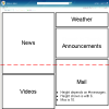 Situation: An ISP wanted to offer their residential Internet customers an engaging and simple user experience with a suite of cobranded Microsoft® products, such as a personalizable web portal with ISP-exclusive "gadgets".
Intervention: With a colleague, I researched competitive products and users' motivations and attitudes regarding these types of products, conducted usability tests of the personalizable portal, and consulted closely with the product team over several years.
Resolution: In the product manager's words, "I can't imagine how this would have turned out without them! ... [They] have had a huge and positive impact on the [Microsoft®] product development efforts."
Supportive email errors
 Situation: An innovative startup's business model depended on demonstrably improving the user experience of email delivery error messages, while tactfully including an ad.
Intervention: Interaction design for email delivery error messages and supporting web site. Creation of a tool for designing message content. User research for ongoing user feedback and to measure user experience improvement.
Resolution: Research demonstrated a greatly improved user experience, with users rating their emotional reactions as much more positive and the message explanations as much better, compared to traditional email delivery error messages.
TV Phone Service
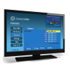 Situation: To boost revenue and customer loyalty, a large telecom company wanted to increase the value to customers of bundling satellite TV with landline phone service.
Intervention: Designed interactive wireframes for a TV app to check voice mail, view caller ID, etc. Tested usability of the app with customers and applied findings to enhance the product further.
Resolution: By making the TV app easy and enjoyable to use, I successfully increased the value to customers of bundling satellite TV with landline phone service.
Business VoIP Web App
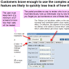 Situation: Identify usability problems and improvement opportunities in a web app through which users of a handset-based business VoIP phone service can access voice mail, view call logs, place calls, and control settings such as call forwarding.
Intervention: Expert review (a.k.a. usability inspection) of web application and its documentation.
Resolution: Identified over 30 usability issues that risked negatively impacting customer loyalty and brand value, and provided redesign recommendations to eliminate these risks. Several issues had potentially serious consequences, such as forwarding a customer's calls to an unintended number or leading a customer to believe that critical settings had been changed when they had not.
Health Insurance Coop
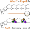 Situation: A new health insurance coop wanted to build responsiveness to members into its culture.
Intervention: I trained key staff to use rapid prototyping whenever they design things that members interact with, then guided them in creating effective member feedback processes.
Resolution: The coop's improved organizational culture and practices of member engagement and listening helped to effectively differentiate it from non-coop health insurers.
VoIP Engineering Web App
 Situation: A pair of web apps used by telecom engineers to provision VoIP phone service could not accommodate orders with many thousands of telephone numbers.
Intervention: Designed single integrated app with greatly improving usability and sophisticated tools for working with large numbers of phone numbers at once.
Resolution: Faster and more accurate provisioning of large VoIP orders was facilitated by an elegant and intuitive tool with greatly expanded capabilities.
Telecom Wholesale Ordering App
 Situation: A large telecom company needed to replace a legacy paper-based wholesale ordering process with a web app, taking the opportunity to make the complex ordering process as simple, efficient, and error-proof as possible.
Intervention: After studying the ordering process in depth and inspecting competitors' apps, I designed a strikingly simple and intuitive web app that represented the industry standard paper forms visually, simplifying an inherently complex process.
Resolution: An unsolicited user testimonial indicates the success of the app: "I just wanted to leave a note to say that your QORA system is by far better than any of the other systems for ordering that I have used. It is very very user friendly. Thanks for making my job easier!"
Landline Mobile App
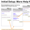 Situation: Before launching its first Android mobile app, integrating mobile and landline phone service, a telecom company wanted to ensure the app was easy to use.
Intervention: Usability testing of first run app user experience, with customers who had home phone service and an Android mobile phone.
Resolution: Usability testing indicated that many users would abandon the app before experiencing its value, due to a confusing initial setup process. I provided specific insights into how to fix this before launch.